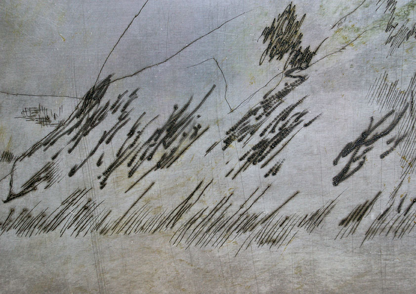
The next process covered by the course was painterly (or mono) screen printing. This part of the course was taught by Jenni Nuttall (have a look at her work here: Jenni). This process involves using a blank screen - the ink is painted directly onto the screen and the colours are built up in layers. We weren't aiming for the pieces to actually look like anything so marks were experimental rather than carefully considered - working in this way felt quite liberating (and for me a little bit scary at the same time) as we could just mess around and see how things looked without worrying too much about themes or image. I sometimes find colour a little bit intimidating - especially during printing as it's hard to know how things will look or work without actually doing a print and screenprinting in particular can make colours look really flat. I picked a bright blue and deep yellow ochre as I wanted colours that evoked the sea/coast (although they haven't ended up doing that very much..).
The 'ink' is actually acrylic paint which is loosened up with a screen print medium - with this process it was possible to paint blobs, marks and lines onto the screen with the ink and then flood the screen with medium. Doing this meant that only the marks were transferred on to the paper (the medium helped to push them through the screen). On a couple of the prints I painted the clear medium on to the screen and then flooded with a colour ink which left white gaps which I really loved (see the first, fourth and fifth images).
I'm really happy with the images that I produced however I'm not sure what to do with them - I don't want to work into them further as there's a possibility that I could ruin them but they don't really feel like my work as they're so abstract.


